UX Designer and Researcher
UI-
Finance
App
Design
Feb 2024
This project focuses on designing a finance management app for Gen Z, developed in Figma after conducting research into how younger demographics approach money management. The design responds to common challenges around balancing essential expenses with discretionary spending, offering a simple, intuitive way to organise personal finances.
The User
The Challenges
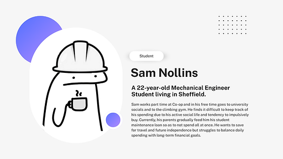
Gen Z users are digitally fluent but often face unique financial pressures, including irregular income, rising living costs, and limited experience with long-term budgeting. Through user research and behavioural insights, this project focused on understanding how this demographic tracks spending, prioritises essentials, and engages with financial tools. The design therefore prioritises clarity, accessibility, and low-friction interactions to support confident, everyday money management.

Designing for Gen Z presents challenges around maintaining engagement while keeping financial information clear and accessible. Many users have limited budgeting experience and may feel overwhelmed by traditional finance tools. The experience therefore focuses on simplifying complex information and making everyday money management feel intuitive and approachable. The first step was identifying what are the main difficulties with budgeting for Gen Z. The insight board took form through interviews, empathy mapping and observation.

Clear trends became apparent when I compressed the issues and queries from my responses into Pain Pages. Current finance apps like Revolute and Monzo were hailed for there instand feedback when spending and live balance updates but fell short when it came to visual clarity and hierarcy. The resounding feedback was that there should be more prioraty given to the most prominant actions. A real game changer was uncovering the insight that Gen-Z would benefit from allocated "pots" for different catagorise to provide more control.

Designing the solution
-User Flow
Based on my research, I used the insight of the 'pots' and clearer hierarchy to develop and iterate on flow graphs to support clear navigation between these pots while reducing friction points in the experience. By simplifying interactions and improving visual clarity, the final flow creates a more intuitive system that helps users confident.
%20(Copy).jpg)
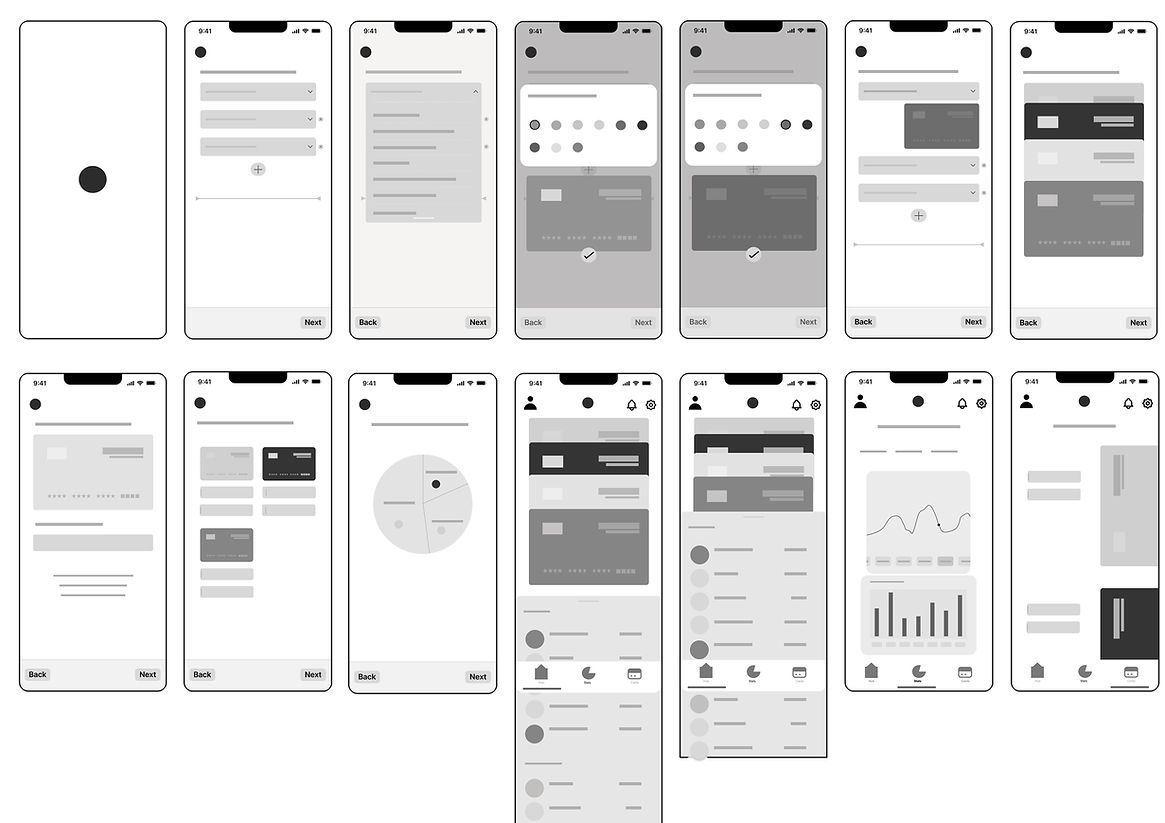
-Wireframing
After rough hand prototyping on paper, the app development was brought into Figma, to create wireframing. Ignoring visual language from colour pallets and fonts, It strips the app experience to its core. This process brought forwards the importance of highlighting the visual cards ('pots') and how the app allows the user to freely interact with them so they almost feel like physical cards for each and any of there fiancial requirments.